Cargador DJI 100W USB-C para Mavic 3 y Avata
cargador portátil dji de 65 w
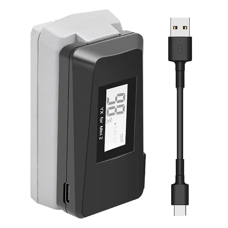
Cargador rápido USB LED para batería DJI Mavic Mini 2
DJI Batería para Mavic 3 pro
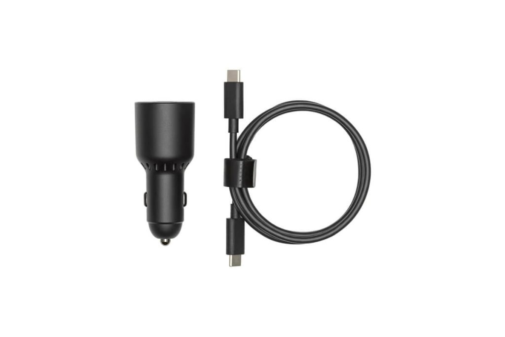
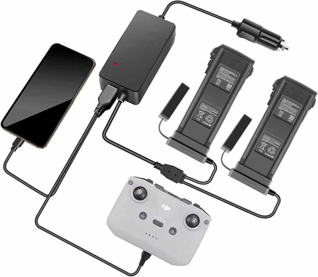
DJI 65W Cargador de Automóvil
DJI Air 3S Lente gran angular
DJI Batería DJI Air 3S
DJI Juego de filtros para DJI Mavic 3 Pro ND (ND8/16/32/64)
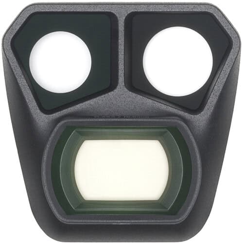
DJI Lente gran angular para DJI Mavic 3 Pro
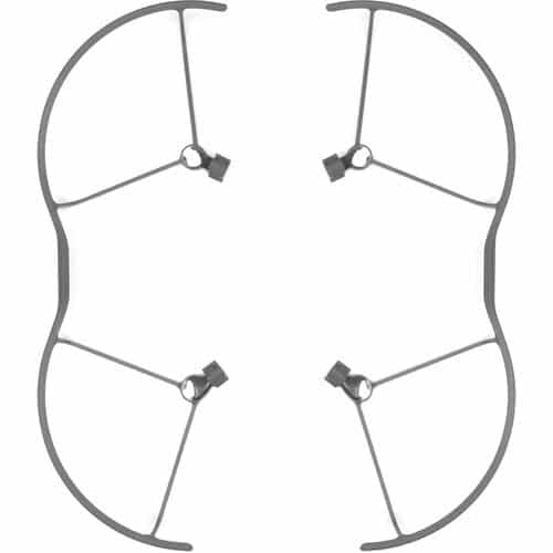
DJI Mavic 3 Pro Protector De Helices
DJI Mavic 3 Pro Storage Cover
DJI ND Kit de filtros para Mavic 3 Classic (ND8, ND16, ND32 & ND64)
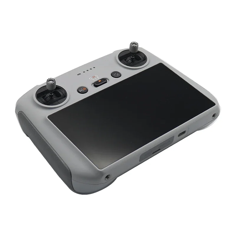
DJI RC 2 Mando a distancia
DJI RC Pro Mando a distancia
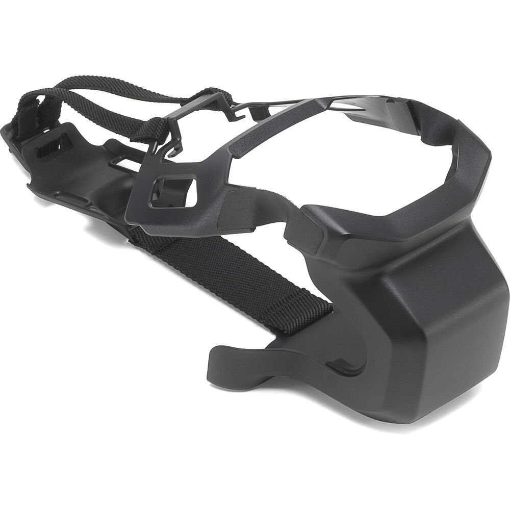
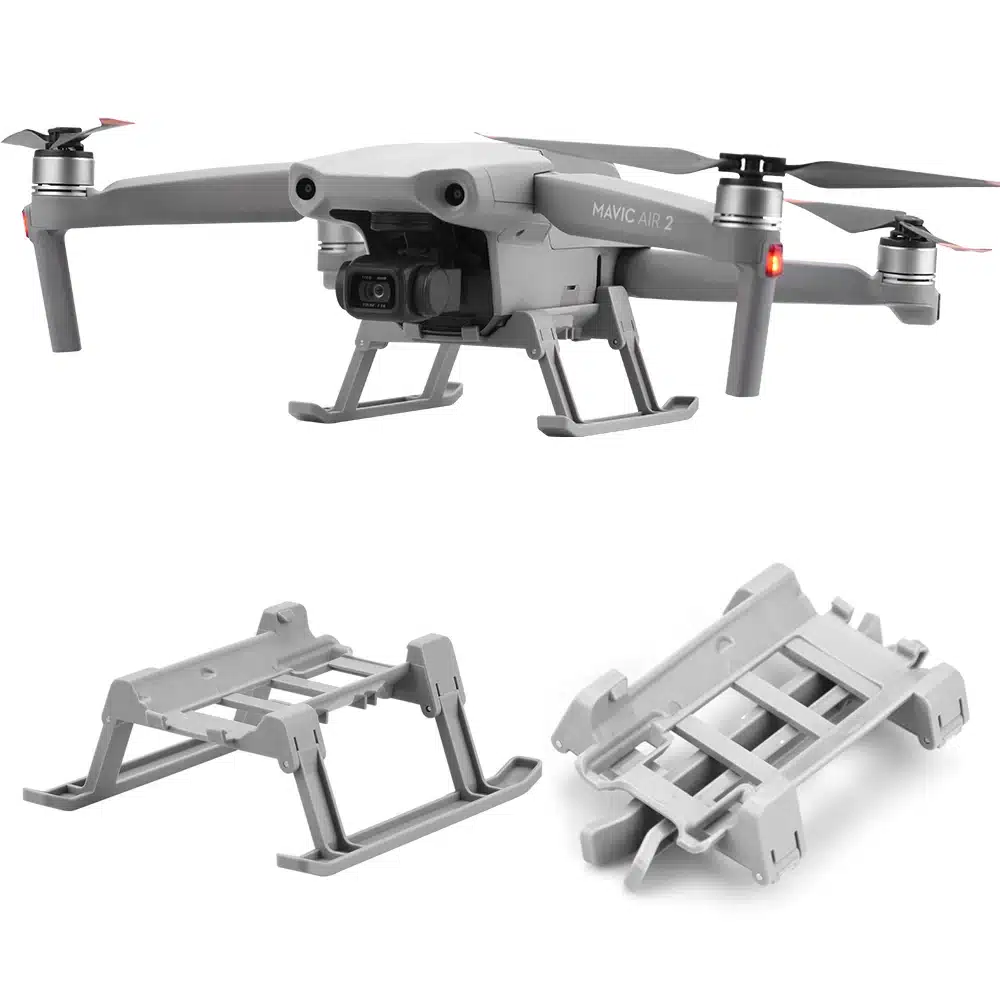
Drone Zone Tren de aterrizaje para Dron DJI Mavic Air 2/AIR 2S
Freewell filtros para DJI Mavic ND/PL, ND, UV, CPL (8-Pack) para Mavic 3 Pro/Mavic 3 Pro Cine
Hanatora Cargador para automóvil de batería 4 en 1 para DJI Mavic 3/Classic/Pro/Cine/Enterprise
LKTOP 200W Carga Rapida para DJI Mavic 3 / Mavic Pro Cinema
Startcr Tren de aterrizaje para DJI Air 3/3S
Online store of household appliances and electronics
Then the question arises: where’s the content? Not there yet? That’s not so bad, there’s dummy copy to the rescue. But worse, what if the fish doesn’t fit in the can, the foot’s to big for the boot? Or to small? To short sentences, to many headings, images too large for the proposed design, or too small, or they fit in but it looks iffy for reasons.
A client that’s unhappy for a reason is a problem, a client that’s unhappy though he or her can’t quite put a finger on it is worse. Chances are there wasn’t collaboration, communication, and checkpoints, there wasn’t a process agreed upon or specified with the granularity required. It’s content strategy gone awry right from the start. If that’s what you think how bout the other way around? How can you evaluate content without design? No typography, no colors, no layout, no styles, all those things that convey the important signals that go beyond the mere textual, hierarchies of information, weight, emphasis, oblique stresses, priorities, all those subtle cues that also have visual and emotional appeal to the reader.


